PT-BR Projeto desenvolvido para o concurso da nova marca do CAU/BR - Conselho de Arquitetura e Urbanismo do Brasil.
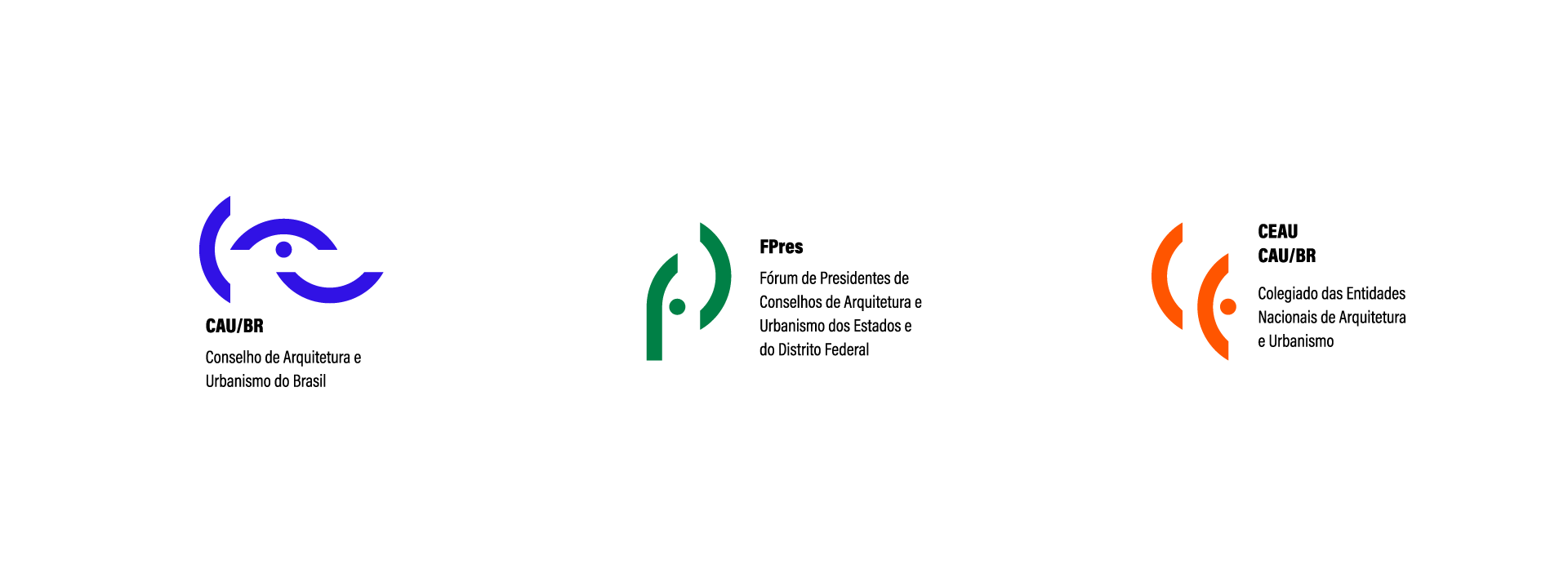
Para elaborar o logotipo para CAU/BR, FPres e CEAU CAU/BR sem recorrer a clichês óbvios (como prédios, colunas gregas ou esquadros) o caminho para a criação exigiu uma abordagem mais conceitual e simbólica. A partir da forma circular, segmentei algumas partes para criar uma “meia lua”, utilizei das formas curvas em referência a estética fluída e orgânica do período modernista brasileiro, que também é o período em que a luta pela criação do conselho se iniciou (1958).
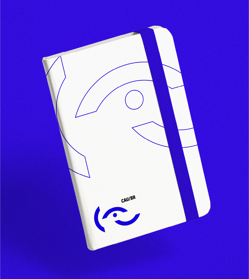
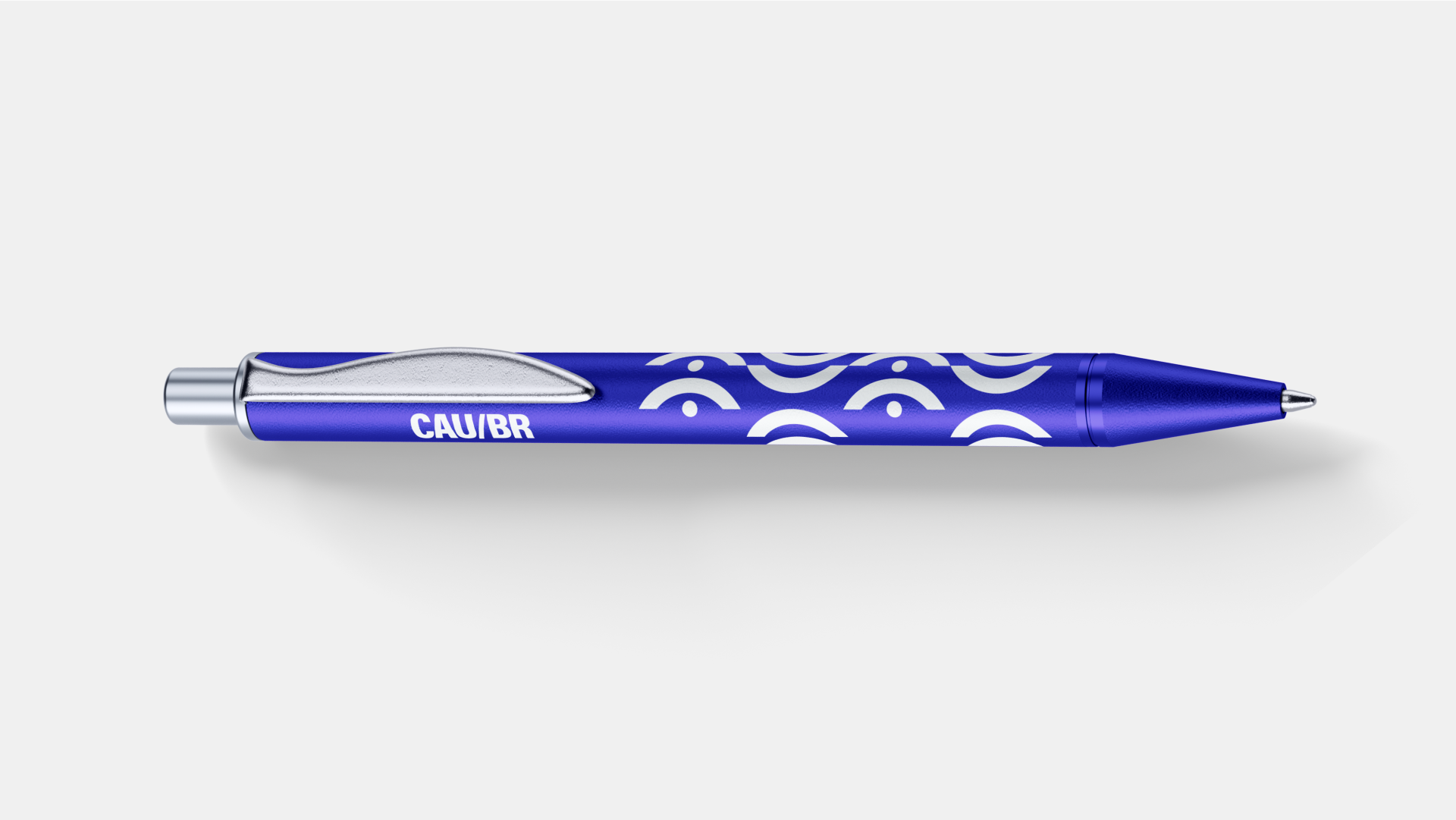
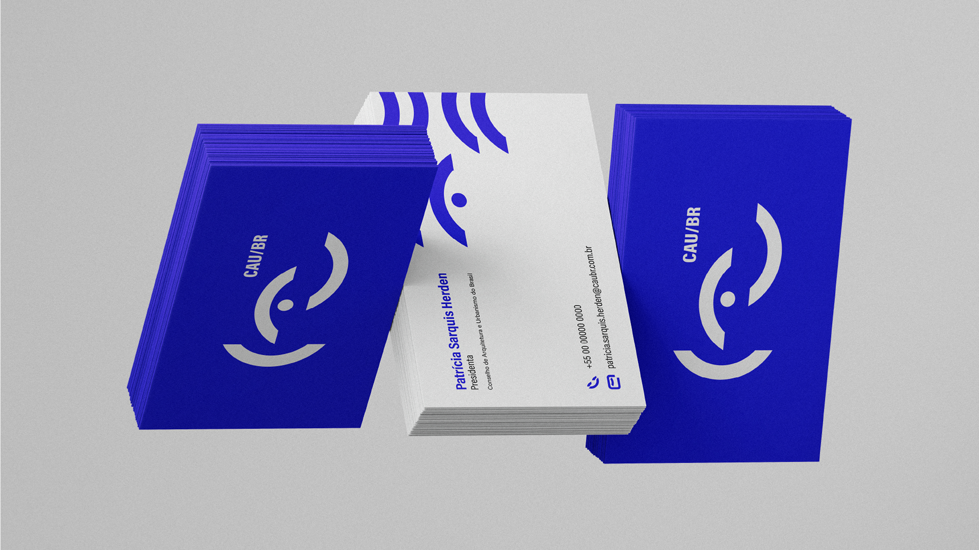
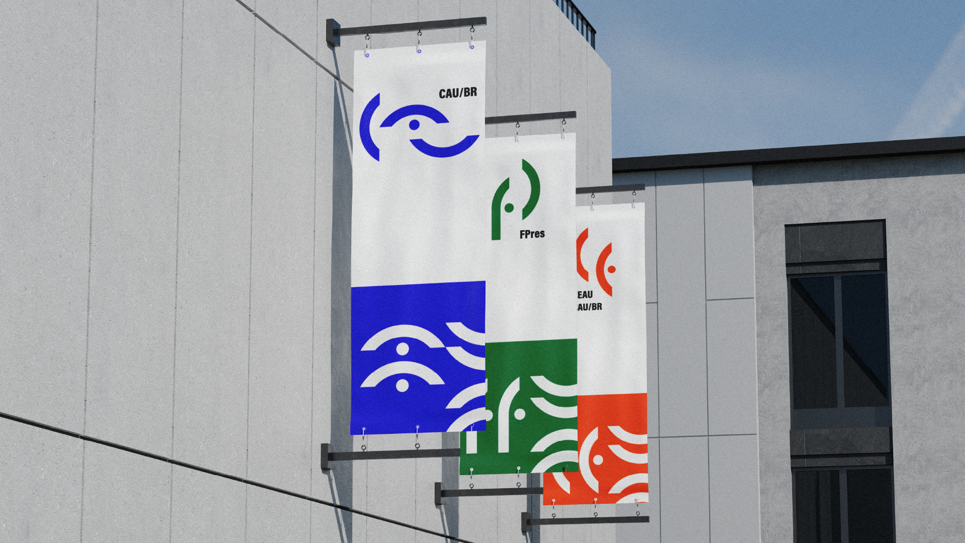
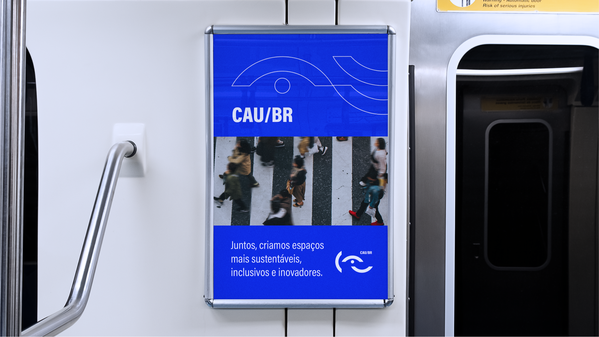
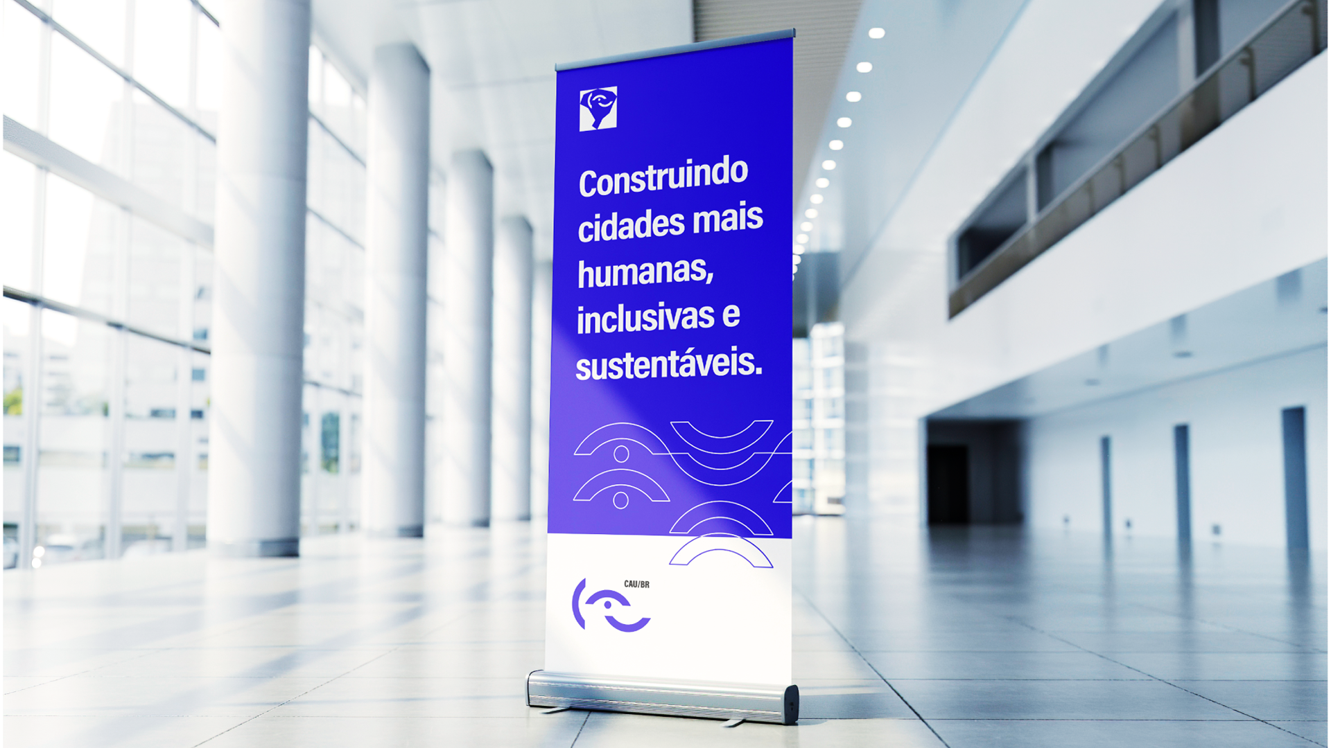
O logotipo do CAU/BR foi concebido a partir de elementos que formam a sigla “CAU”, o elemento central do logotipo que representa a letra “A” tem o simbolismo de um olho, que representa o papel do conselho no que diz respeito em “orientar, disciplinar e fiscalizar o exercício da profissão de arquitetura e urbanismo”. As logos do FPres e CEAU CAU/BR derivam da marca principal do CAU/BR, utilizando as mesmas formas gráficas que representam as primeiras letras das siglas de cada um, “FP” e “CE”, respectivamente.
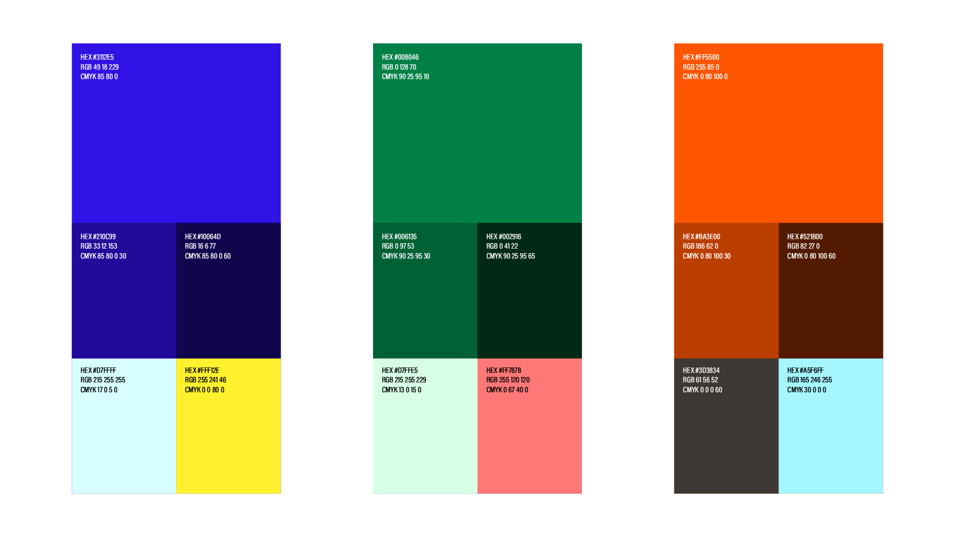
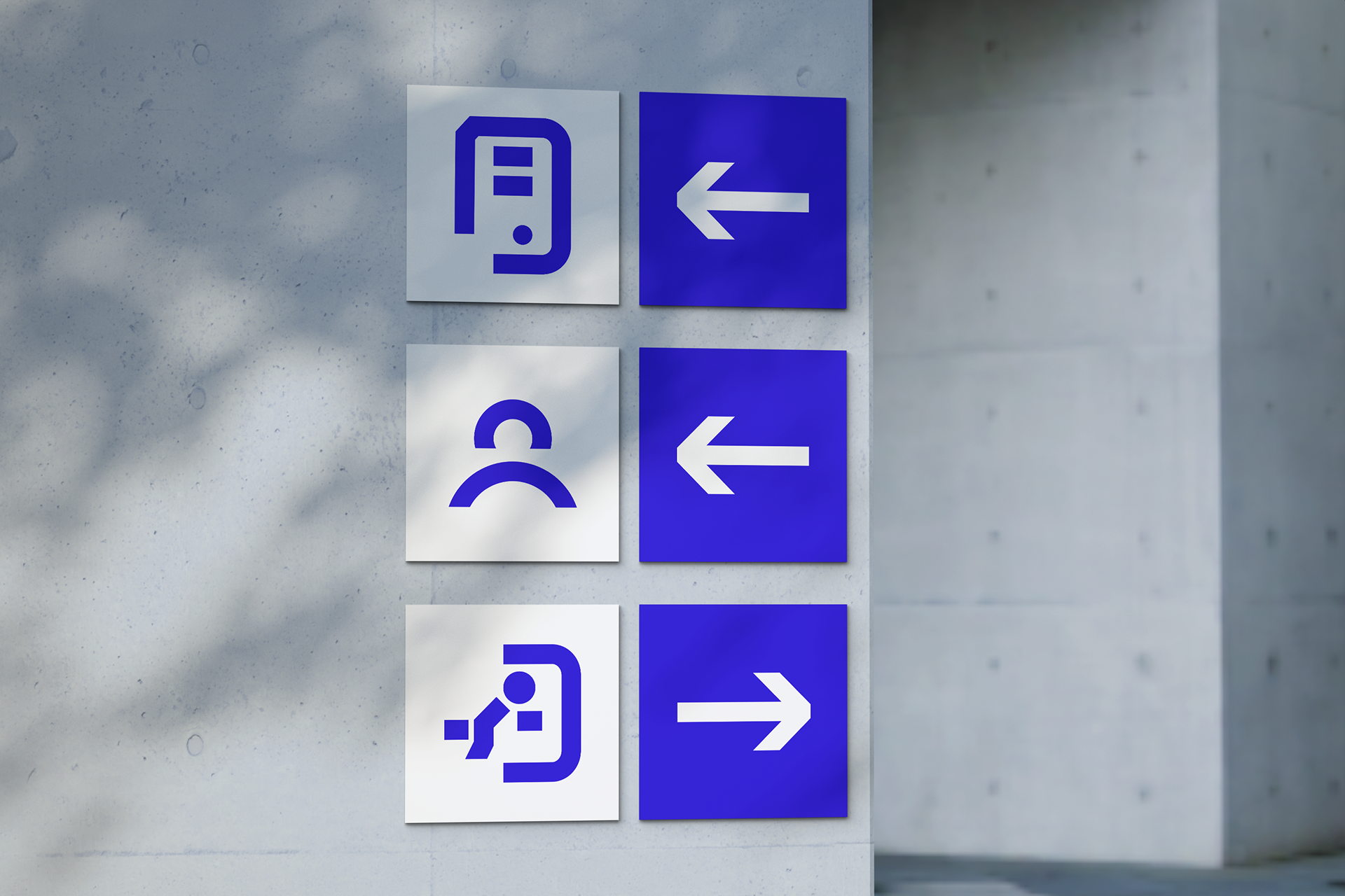
Para garantir a diferenciação de cada segmento, optei por utilizar cores distintas que no estudo realizado se sairam como melhores opções em questão de acessibilidade e aplicabilidade em diversos meios, com bom contraste e leitura.
EN-US Project developed for the competition for the new brand of CAU/BR - Brazilian Council of Architecture and Urbanism.
To create the logo for CAU/BR, FPRES and CEAU CAU/BR without resorting to obvious clichés (such as buildings, Greek columns or squares), the path to creation required a more conceptual and symbolic approach. Starting from the circular shape, I segmented some parts to create a “half moon”, I used curved shapes in reference to the fluid and organic aesthetics of the Brazilian modernist period, which is also the period in which the fight for the creation of the council began (1958).
The CAU/BR logo was designed from elements that form the acronym “CAU”, the central element of the logo representing the letter “A” has the symbolism of an eye, which represents the role of the council in “guiding, disciplining and supervising the practice of the profession of architecture and urbanism”. The FPres and CEAU CAU/BR logos are derived from the main CAU/BR brand, using the same graphic forms that represent the first letters of the acronyms of each, “FP” and “CE”, respectively.
To ensure the differentiation of each segment, I chose to use different colors that, in the study carried out, were the best options in terms of accessibility and applicability in different media, with good contrast and readability.